Please take a moment to give me some anonymous feedback by completing this survey.
Your feedback and opinion is greatly appreciated. Thank you.
Please take a moment to give me some anonymous feedback by completing this survey.
Your feedback and opinion is greatly appreciated. Thank you.
Filed under Uncategorized
Did you make any yet? Are you confused, unsure of how to start? That’s ok. That is what this post will explore. First, the purpose of generating a concept map is to help you brainstorm potential concentration topics/themes. Remember, a concentration is an in-depth exploration of a particular design concept. Your concentration should be based on an idea in which you have a strong personal interest or connection. So the concept map is a way to organize your thoughts and generate some ideas. The concept map is a way to test your concentration idea, to see if it will generate enough content for your concentration.
A concept map shows the relationships among a set of connected concepts and ideas. It is a tangible way to display how your mind “sees” a particular topic. It is a way to help you think through a topic. By constructing a concept map, you can reflect on what you know and realize what you don’t know. In a concept map, the concepts are usually represented by single words enclosed in a box or circle and are connected to other concept boxes by arrows or lines.

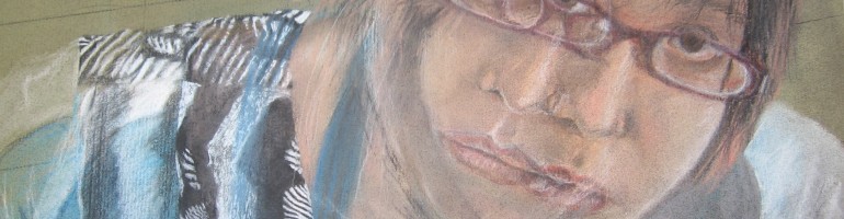
So we will walk through this process using the concept map I made in June. First, I started by choosing the theme of THYROID. I chose this for personal reasons: I have been hypothyroid for 7 years and had recently been struggling with some health issues related to my thyroid (nothing serious and it’s all fixed now because I have an awesome doctor). The term thyroid was placed as my MAIN IDEA in the center of the concept map. Second, I identified facts, terms, and ideas that I thought were associated with the topic (THYROID). I made a list of these items in my sketchbook which I will either show you later this week or will scan and post here if I have the time. When I looked at my list, I determined that the information on the list could be divided into four areas: levels & medication, medical, symptoms, and blood test. Third, I labeled each quadrant of the concept map with these four areas in red. Lastly, I wrote the words from the list items into the proper place on the concept map.
After creating this concept map, the next step would be for me to generate several sketches based on these ideas with the hope that I’d have enough content to create 12 pieces of art work. Whew! Did you get all of that? If not, try your best. We will spend time during the first week of school reviewing how to create a concept map. If you are not sure where to begin or what topic to choose for the central theme, I would suggest choosing ideas from the the summer assignment sketchbook pages:
Filed under Concentration, concept map, Sketchbook
If you are working on your summer sketchbook assignments, here are some examples of creating a two-page spread. You will choose any 4 of the six ideas listed and create a two-page spread.

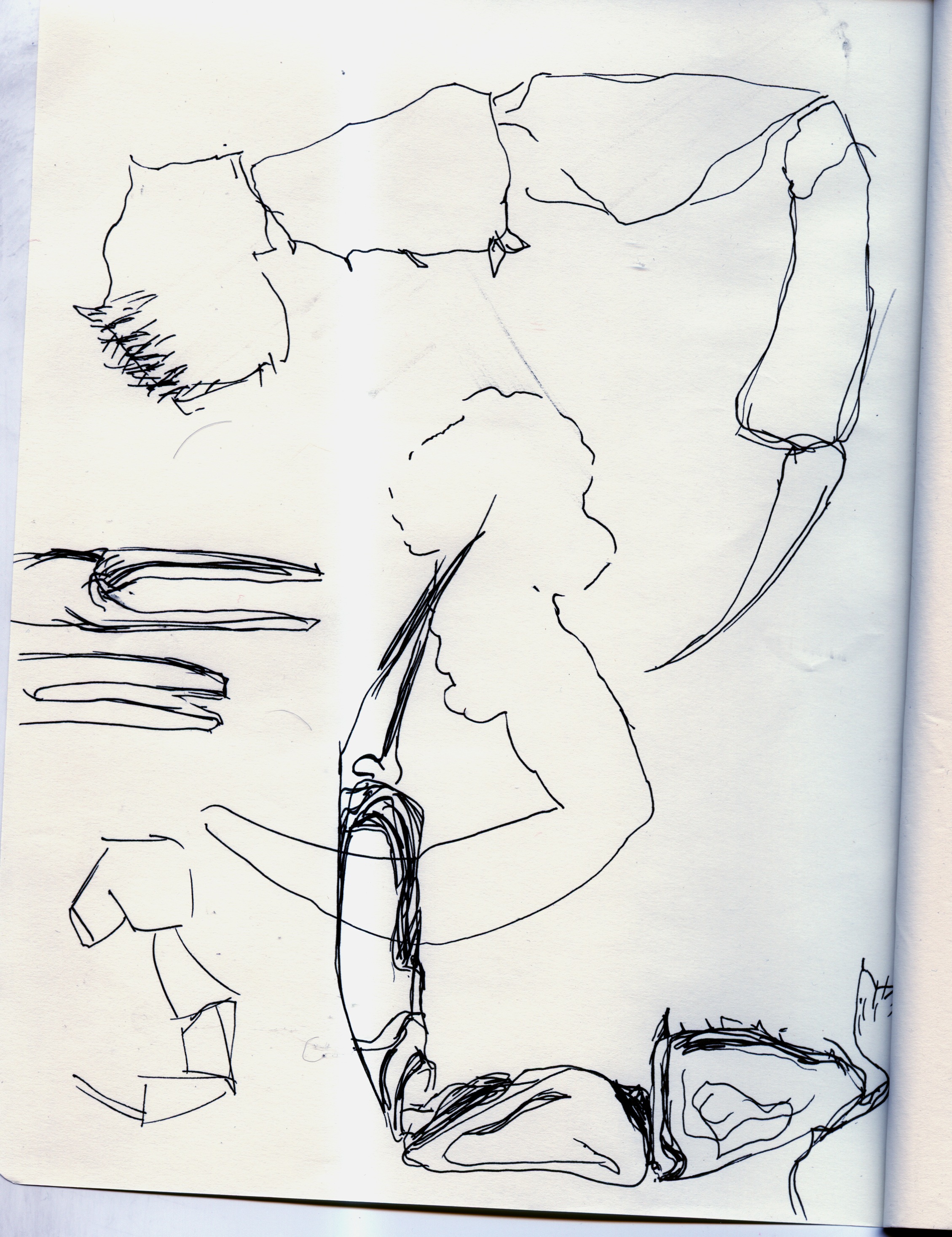
sketchbook page by Gabriel Campanario
Here is the work of journalist and illustrator Gabriel Campanario. He is known for his award-winning Seattle Times blog and weekly column Seattle Sketcher, an illustrated journal of life in the Puget Sound region. You can see more of Gabriel’s work on his blog. I originally found his work on Doodlers Anonymous. If you haven’t checked out Doodlers Anonymous, you should. There is tons of awesome art work, all in sketchbook form, on there.
Yet another example I found on Doodlers Anonymous, the work of stupot.

travel sketch by stupot
And for good measure, I’ll share some of mine:


![]()

Filed under Sketchbook

Blue Horse by Matthew Cusick
Check out the artwork of Matthew Cusick. He lives and works in Dallas, TX and received his BFA from the Cooper Union for the Advancement for Science and Art in New York City. His use of maps to denote value, color, and form is amazing! You can check out the rest of his work on his website http://mattcusick.com/. You won’t be disappointed. While you are looking at his work, pay attention to how his website is organized. Each category on the left (paintings & collage, defacements) reveals its own concentration: map works, constellations, happy endings, and passages. Any one of these themes could easily stand on its own as a concentration. Just sayin’…
Filed under Concentration, Elements of Art

new macs in room 328

On August 3rd, Mr. Rodgers and I spent our ninth wedding anniversary setting up the brand new iMac lab in room 328! So when you return to the art room, you will notice some obvious changes to accommodate not one, not two, but six new iMacs. The paper cutter was relocated to the front of the classroom so that the back of the room could be dedicated to the new machines. I’m not sure if the paper cutter will stay in this location but it was a solution for now. Each new machine was loaded with Adobe Creative Suite 5.5 which includes Photoshop and Illustrator. Those of you taking Graphic Design this year will also notice the same new machines & software in room 330 as well.
Filed under Uncategorized
 So here is an example of an idea page: images collected & collaged from magazines. Simply cut out images that you find interesting. Here is one of mine: I like the bike (because I’ve been thinking about getting one) and the green wall behind it, the lemons were simple, just stacked together, the black and white images have great texture. Just think about those elements of art: line, color, texture, shape, value to help guide you.
Start by looking through magazines, newspaper, or other printed material, cut out and paste into your idea book images that might be used as references for future artwork. You should have at least 12 pages of image collages. A page might consist of several images like mine above or just one or two images like this one below that I created.


Filed under Elements of Art
Here are my Idea Book pages for the Elements of Art. I’ve been out of commission for the past week due to hand surgery but now that I’m recovering and need to exercise my hands…I figured I would show you my examples for these pages. Thoughtfully design each page to include at least eight examples. Make your example swatches at least 3″ in any one direction. They can be any shape. I chose circles (which were kind of a pain to cut). Remember to include the definition for each element of art as some of them will look the same. My SHAPE page could easily be a TEXTURE page but since they are labeled, someone looking at these pages will know the difference. Now, I have to get working on the color pages.


Filed under Elements of Art, Sketchbook
…no, not the TV show but my sketchbook pages from a recent visit to the Jersey Shore. I sat on the beach for two days, finished a book, started another one, and added 5 pages of sketchbook drawing to my NEW sketchbook. I figure if I’m asking you to work in your sketchbook this summer, than so should I. So I decided I would do the same assignments I gave you. These 5 pages of mine would probably fall under the “something about summer” or “cafe sketches” (aka beach sketches). I’ve included all 5 of mine so that you could see them however you would only need to complete two pages.


Filed under Sketchbook
Congratulations! You have enrolled in the AP Studio Art course for the 2011-2012 school year. This is a very demanding college level course. If you take your work seriously and keep up with your artistic commitments, you will also find this class very rewarding.
The AP Studio Art exam is a submission of your portfolio. Each of you will be required to create 24-30 quality artworks (YIKES!) for your AP portfolio. This is a daunting task for a semester-long class. Therefore, it is essential to put forth your best effort in your summer homework. If you need materials, see me before the last day of school. Your summer homework is due the first week of school and will count as your first sketchbook and project grades. More details on this to follow.
As an AP studio artist, you are expected to submit high quality artwork that can be comparable to artwork produced at the college level. These works are vital to the development of your AP Portfolio. It will add to the required AP sections: Quality, Concentration, & Breadth. In some cases, it will be a realization process for you to understand yourself better as an artist.
Remember to stay positive (you can do this, and do it well!), challenge yourself, and work hard. Good luck, and I look forward to seeing your great art the first week of school.
Filed under Concentration, Sketchbook
For the 2011-2012 school year, we will utilize this blog as a place to post assignments and discuss the various components of the AP Studio Art course at Strath Haven High School. Still to come, in future posts, will be the summer homework idea book and sketchbook assignments along with information from the College Board. Stay tuned.
Filed under Uncategorized
